 bref
Use a prebuilt theme
Reusable component themes with individual package entry points and interactive galleries.
Availability
Full themes own their component styling and have individual package entry points. Each gallery below imports its theme through the matching public package entry point.
Install bref-ui-themes on npm in a Svelte 5 app, then import components from the theme's entry point:
npm install bref-ui bref-ui-themesBref-ui 3 and Svelte 5 are peer dependencies. Shared types come from bref-ui/types and are re-exported as types from bref-ui-themes . The custom text font remains optional.
<script>
	import { Theme, Button } from 'bref-ui-themes/new-paris';
</script>

<Theme><Button label="Save" /></Theme>
Every prebuilt Theme accepts the same ThemeProps as core Theme:
| Prop | Type | Required | Default | Description |
|---|---|---|---|---|
palette | Palette | { dark: Palette; light: Palette } | No | {} | Optional semantic hex colors; a shared palette applies to both modes. Invalid hex values throw. |
children | Snippet | No | — | Optional application content. |
<script lang="ts">
	import { Theme as CrystalCodeTheme, Button } from 'bref-ui-themes/crystal-code';
	import type { Palette } from 'bref-ui/types';
	const palette = { primary: '#6750a4' } satisfies Palette;
</script>

<CrystalCodeTheme {palette}><Button label="Save" /></CrystalCodeTheme>
A shared palette applies to both modes. Separate overrides use palette={{ light: { primary: '#6750a4' }, dark: { primary: '#d0bcff' } }} . Each mode keeps the theme defaults for omitted colors. Overrides stay local to each instance,
including nested themes. Private material and typography tokens remain theme-specific.
Use ThemeModeToggle for light, dark or system mode. Local data-theme="light" , data-theme="dark" or data-theme="auto" containers select the mode for nested themes; the nearest container wins. Without a mode selection,
Crystal Code follows the system, New Paris and Glassy stay light, and VS Code stays dark.
Demo shows complete applications using canonical Bref components and palette configuration.
New Paris
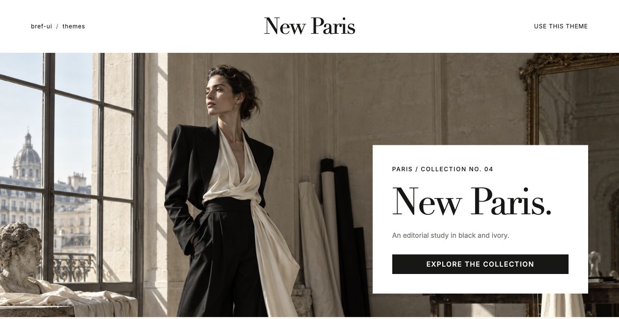
New Paris
Black and ivory controls, serif typography and opaque paper overlays.
Open gallery → (opens in new tab)New Paris loads Material Symbols icons automatically with Theme. Its custom text font is optional to avoid adding unused font assets to apps; text falls back to system fonts. To match the gallery typography, install and import Inter :
npm install @fontsource-variable/inter<script>
import '@fontsource-variable/inter/index.css';
import { Theme, Button } from 'bref-ui-themes/new-paris';
</script>
<Theme><Button label="Save" icon={{ name: 'check' }} /></Theme>
bref-ui-themes/new-paris
Glassy
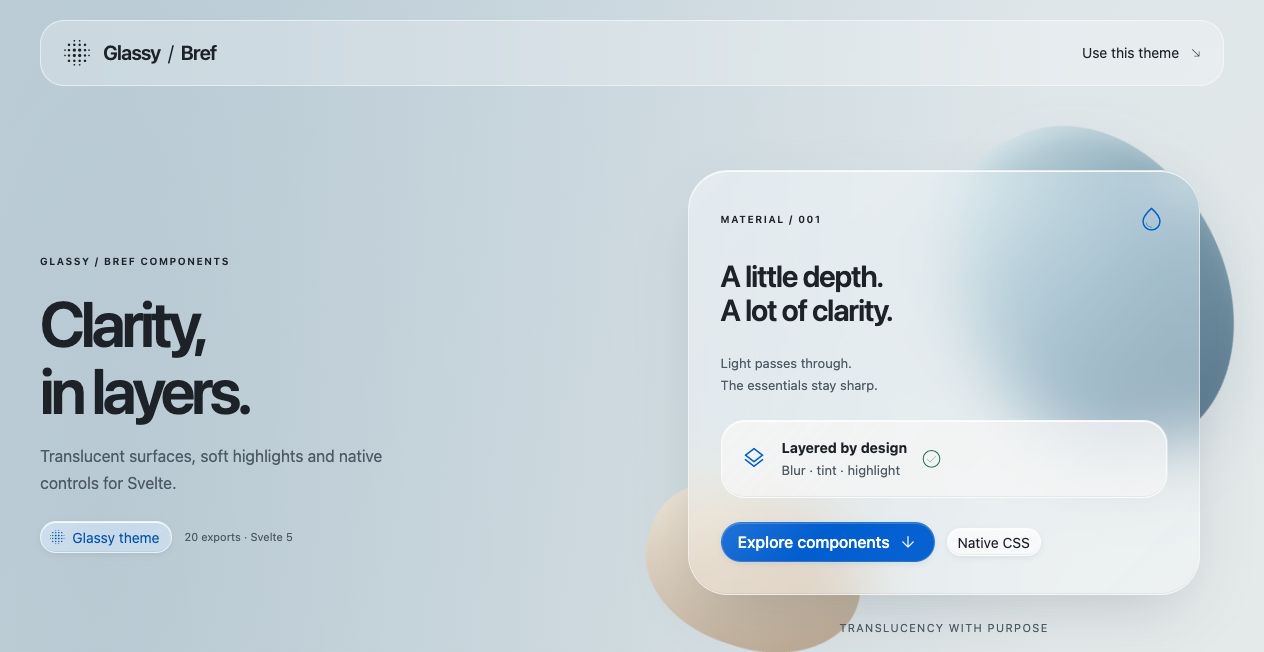
Glassy
Translucent controls, frosted overlays and soft gradient backgrounds.
Open gallery → (opens in new tab)Theme loads Material Symbols automatically. Inter stays opt-in to avoid unused font assets:
npm install @fontsource-variable/inter<script>
import '@fontsource-variable/inter/index.css';
import { Theme, Button } from 'bref-ui-themes/glassy';
</script>
<Theme><Button label="Save" icon={{ name: 'check' }} /></Theme>
Crystal Code
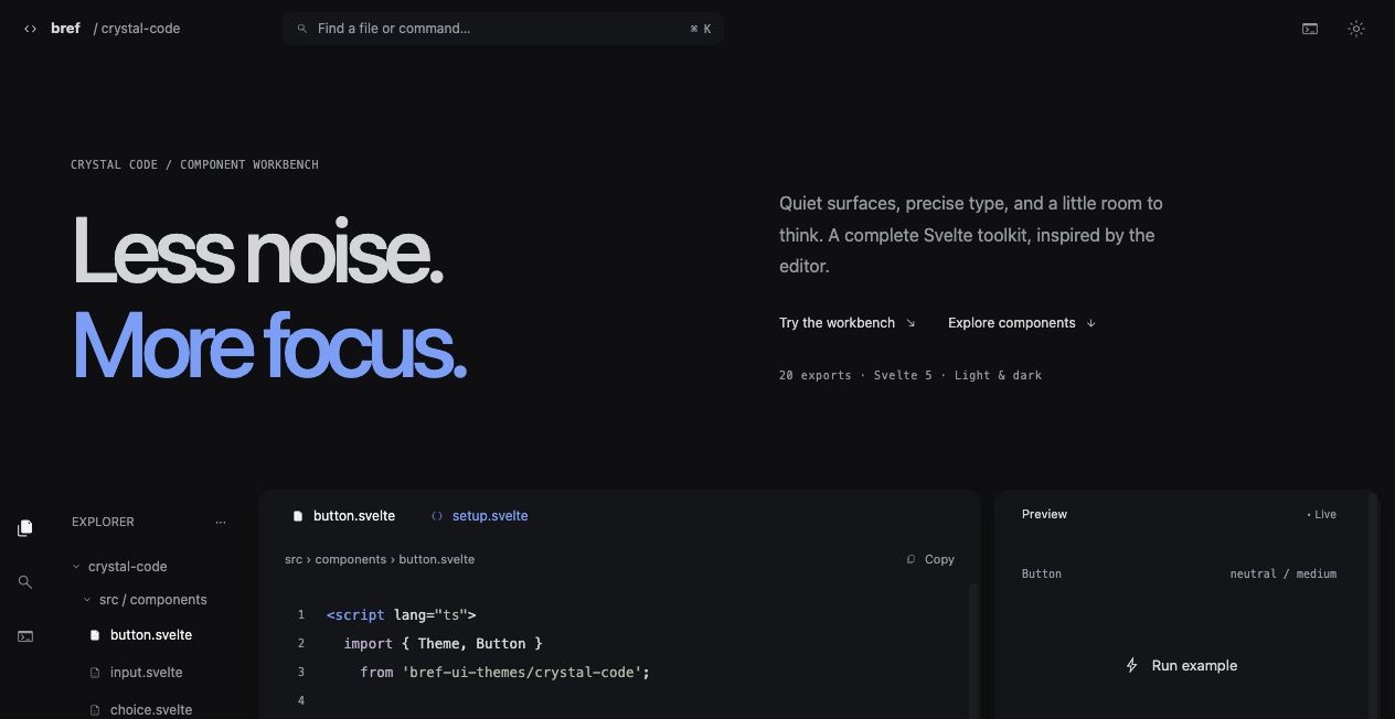
Crystal Code
Light and dark frosted workbench controls with compact editor styling.
Open gallery → (opens in new tab)Theme loads Material Symbols automatically. Inter stays opt-in to avoid unused font assets:
npm install @fontsource-variable/inter<script>
import '@fontsource-variable/inter/index.css';
import { Theme, Button } from 'bref-ui-themes/crystal-code';
</script>
<Theme><Button label="Save" icon={{ name: 'check' }} /></Theme>
VS Code
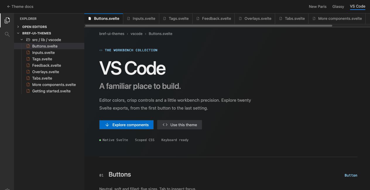
VS Code
Fixed-dark workbench controls with native interactions and scoped styling.
Open gallery → (opens in new tab)Theme loads Material Symbols automatically. Text uses system fonts, so no custom text font installation is required.
<script>
	import { Theme, Button } from 'bref-ui-themes/vscode';
</script>

<Theme><Button label="Save" icon={{ name: 'check' }} /></Theme>